Tuesday, September 24, 2024

Angle, Level, Height, and Distance in Cinematography


1a) Angle- Still image from Titanic, 1997

1b) Level- Still image from Stranger Things, 2019

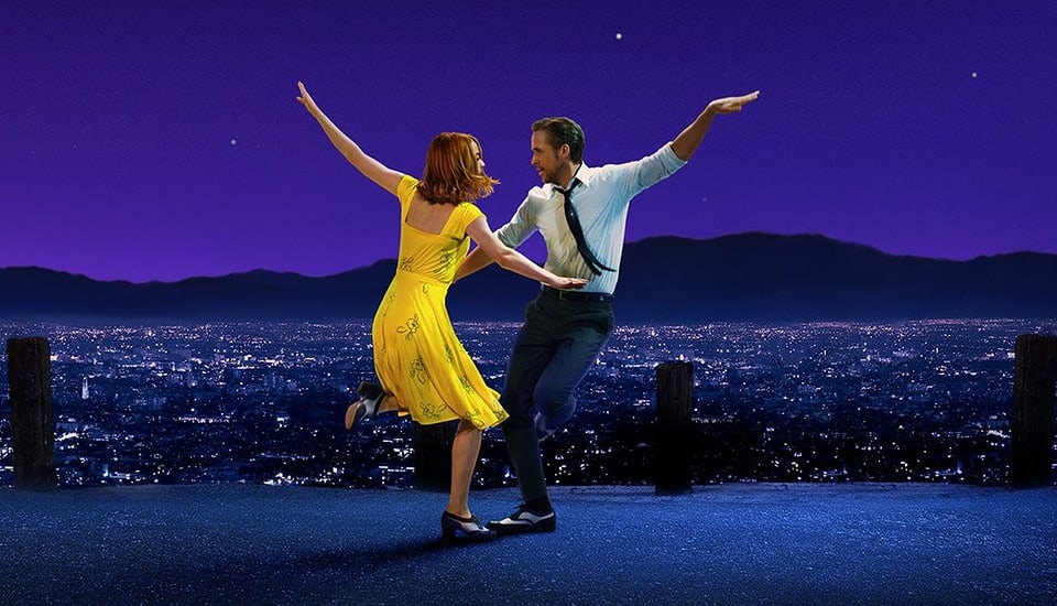
1c) Height- Still image from Barbie, 2023 

1d) Distance- Still image from Dune: Part Two, 2024


2a) A still showing how angle is used to convey conflict, character, or development. 

2b) A still showing how level is used to convey conflict, character or development. 

2c) A still showing how height is used to convey conflict, character, or development. 

2d) A still showing how distance is used to convey conflict, character, or development. 

3)     For most blogs I was able to stand regularly and take pictures. For this blog, I had to work with my angles a lot more. Specifically for my stills conveying angle and height, I had to physically lay on the floor to get the perfect picture. For my still conveying angle, I wanted the picture to look as if the stuffed animals were looking down at something. The low angle shot creates suspense for what the stuffed animals are looking at. Although, it was difficult to set up the animals in this way since the angles of their bodies are not easily changed. Eventually, I figured out a way to use the three different stuffed animals and lean them against each other, creating the perfect angle for what I wanted to accomplish. For my still conveying height, I wanted to take the picture with a focus on the figures' feet. My idea for this still was that the stuffed animal was walking somewhere important, so a feet focused picture could have added development to a scene. The challenge that came with taking this picture was that none of my stuffed animals could stand on their legs by themselves. So, to solve this issue I had my brother hold the top of the stuffed animal. I did not have an issue cropping his hand out since this photo was taken at ground-level height. The focus was the stuffed animals' feet, so the stuffed animals head was not necessary for the picture. 


Tuesday, September 17, 2024

Balancing Mise en scène

Dancing scene from La La Land, with characters set across a dark purple skyline
1a) Contrast- Still image from La La Land, 2016

1b) Color- Still image from Barbie, 2023

1c) Size- Still from Jurassic World, 2015

1d) Frontality- Still from Stranger Things, 2016

2a) A still showing how contrast is used to guide the viewer's attention.

2b) A still showing how color is used to guide the viewer's attention. 

2c) A still showing how size is used to guide the viewer's attention. 

2d) A still showing how frontality is used to guide the viewer's attention. 

    When I started looking at pictures for this blog, it was difficult to decipher between contrast, color, and size. As I researched more on Mise En Scene, I realized that contrast can have to do with color or size and that all these elements intertwine. For example, my contrast picture of La La Land has to do with contrasting colors. Also, any still having to do with size will be a form of contrast because the sizes are different. When creating my own stills I had to make smart decisions to really make things stand out. For example, for my still representing color, I originally placed just the colorful unicorn in the picture. Even though this made the figure stand out amongst the background of the picture, I wanted to show the unicorn standing out amongst other figures. So, I went and found two white stuff animals so that there's no question where a viewer's eyes will go to first. With my frontality picture, it was difficult to pick how much depth was in the picture. I wanted the figure's whole body to be seen, but also did not want the figure to be super small. In order to make both of these work, I had to try a few different angles, but eventually found the one that matched the image of the still I originally created in my head. My overall experience with this blog went well. Doing part one before creating my own stills helped tremendously because I was able to see professional examples. 


Sunday, September 15, 2024

The Rule of Thirds


1) Still image from Titanic released December 19, 1997

This still image depicts the two main characters, Jack and Rose. They are slightly off center following the rule of thirds. This still shows a scene that is recognizable and referenced in other films/media frequently. This scene represents love. It is one of the first moments where we see Jack and Rose falling in love, despite what other people may think of their relationship. The background of this still is a beautiful landscape that mirrors the beauty of falling in love. Rose is hanging off the edge of the Titanic, pretending to fly in this scene. She is taking a leap of faith, just like how she is by falling in love with Jack. This is what makes the scene so iconic and memorable. Although, Jack is just as important as we visibly see him falling in love. We can tell Jack is admiring Rose in this scene because his only focus is her. So, the rule of thirds helps to create a focus on both characters even though the context might make viewers initially focus on Rose more. 


2a) A photo taken without regard to the rule


2b) A photo taken with the horizon with a horizontal rule line and focal objects lined up with hot spots (interactions between horizontal and vertical lines on the tic-tac-toe grid) 


3a) A photo taken without regard for the rule 


3b) A photo taken with the object figure aligned with hot spots on either vertical line


4a) A photo taken without regard for the rule 


4b) A photo taken with eyes and landscape aligned according to the rule and figures with neutral spacing 

4c) A photo taken with eye and landscape alignment and vertical placement to suggest agreement or attraction 

The figures are placed on the left vertical line of the tic-tac-toe grid. This two-shot shows the figures close in proximity and facing each other. The figures are embracing in a hug which shows the attraction and love between them. The figures are close to the camera since the focus is them but their full bodies are still seen to really appreciate their hug. The background is simple which puts more emphasis on the figures in this still. The figures are different colors showing contrast between them. This shows that they are independent, yet appearing as one because of the love between them. This idea of them "appearing as one," is further proved through them being placed in the same vertical line in the grid. The window behind them brings in lighting making the still conventional and gives a happy tone when combined with the love the figures are portraying. 


4d) A photo taken with eye and landscape alignment and vertical placement to indicate disagreement, conflict, threat/menace, or unrequited love


Final Cut